A random variable is a mathematical abstraction that provides a bridge between theoretical probability and real-world data. Every dataset can be viewed as observations from random variables.
Despite the outcome of any one event being uncertain, we can use patterns from past observations to predict the general behavior of these variables. By collecting data, we can figure out how often certain outcomes occur and connect them to theoretical distributions.
We can describe the distribution of a variable with summary statistics: such as quartiles, deciles and percentiles.
summary(exam$overall)
   Min. 1st Qu.  Median    Mean 3rd Qu.    Max.
  45.00   72.00   77.50   76.56   84.00   99.00
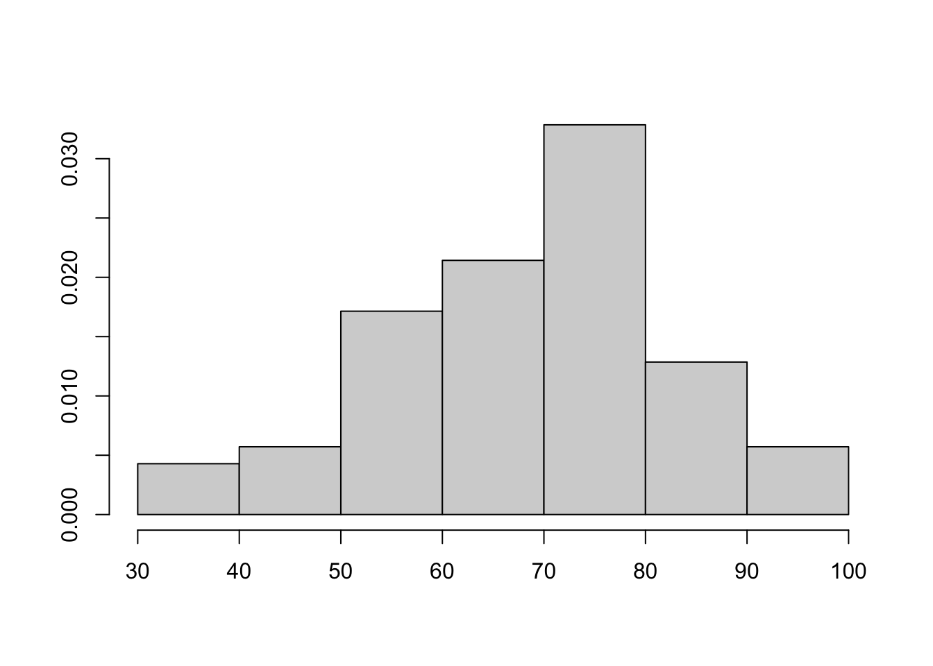
Histograms
One way to visualize the distribution of a variable is to plot a histogram. A histogram groups data points into intervals, showing how often data values fall within each range. The horizontal axis represents the intervals (or bins), and the vertical axis shows the frequency or count of data points in each bin.
A histogram gives an approximation of the true (unknown) distribution. It is not itself the distribution. A distribution refers to the theoretical assignment of probabilities across all possible outcomes, whereas a histogram represents the empirical frequencies observed in a finite sample.
hist(exam$final, prob = T, ann=F)
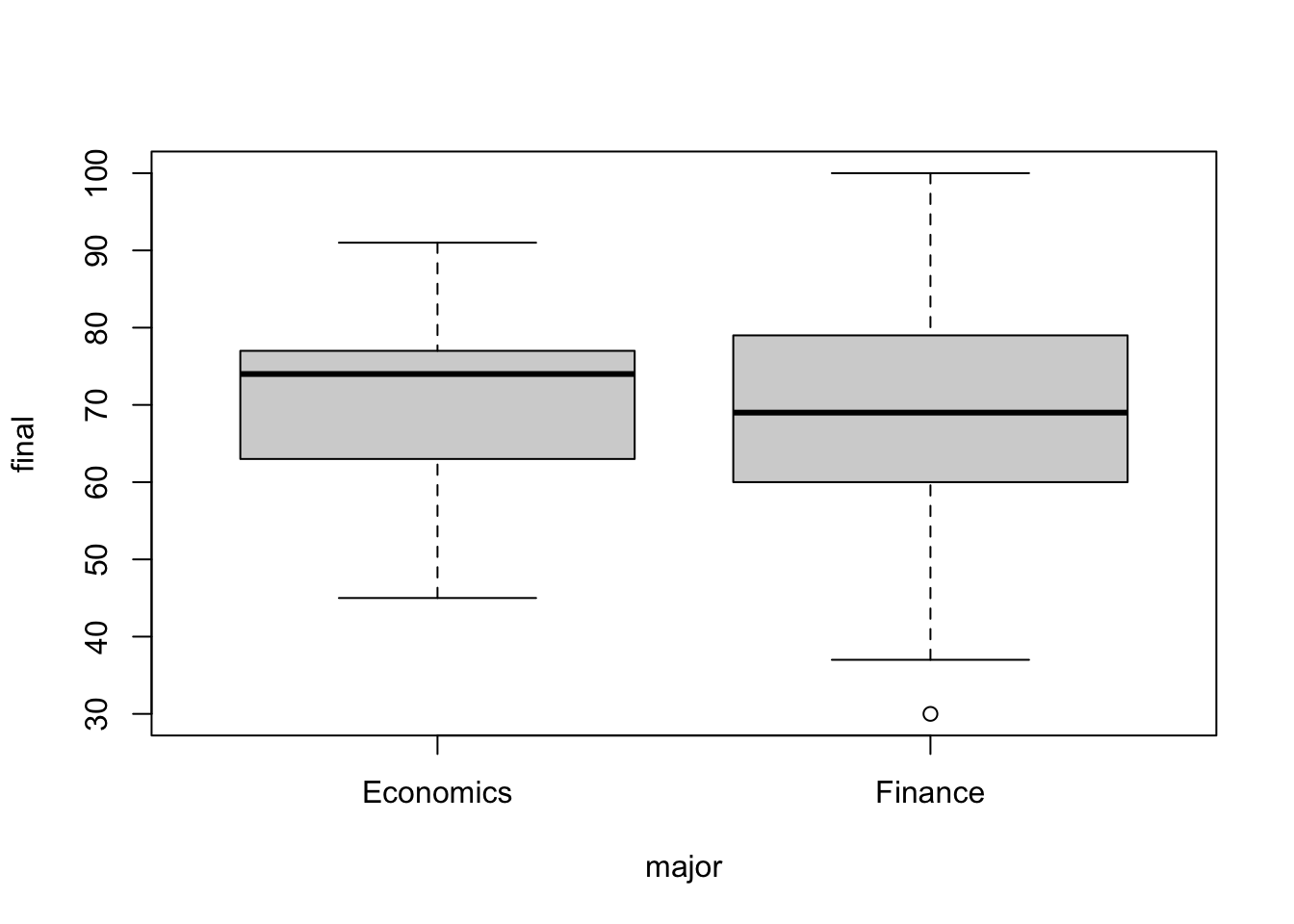
Boxplots
A boxplot, also known as a box-and-whisker plot, displays the median, quartiles, and range of the data. The box represents the interquartile range (IQR), which contains the middle 50% of the data, with the lower and upper edges corresponding to the first (Q1) and third quartiles (Q3). Whiskers extend from the box to indicate the range of values within 1.5 times the IQR from Q1 and Q3, while points beyond this range are considered outliers.
boxplot(final ~ major, exam)
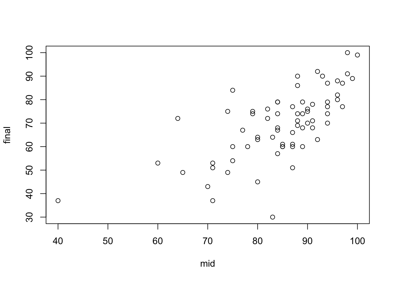
Scatter plots
To observe the relationship between variables, it is straightforward to make a scatter plot of \(Y\) against \(X\). An upward-sloping pattern in the scatter plot indicates that the variables tend to move together, whereas a downward-sloping pattern suggests that they move in opposite directions. A flat slope implies the absence of correlation between the two variables.